Centered Content (boxed)
Text/Image on Patterned Bg
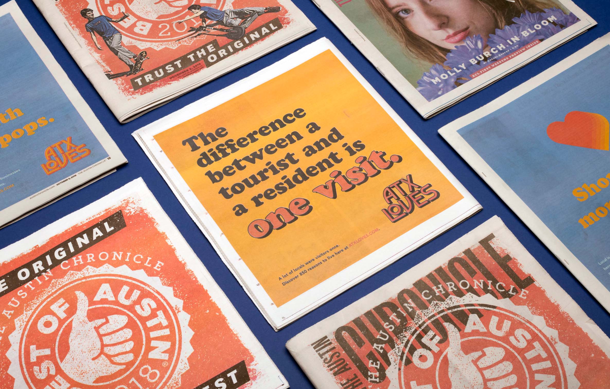
Two elements added, Content Editor and Image. The content editor will always have centered text. The image is set to extend below the patterned background and have a thin width.
Text + Text
Text/Image on Patterned Bg
Two elements added, Content Editor and Image. The content editor will always have centered text. The image is set to extend below the patterned background and have a thin width.
Content Editor
Default width shown, also has a wide option. Lorem ipsum dolor sit amet, consectetur adipiscing elit. Mauris accumsan, est vel commodo consequat, eros tortor fermentum purus, id efficitur ex lectus a nibh. Aliquam cursus odio vel orci malesuada, ut egestas lorem dictum. Nulla viverra est elit, consequat suscipit nisi imperdiet vitae.
Heading: Large
- Lists
- Donec ullamcorper venenatis porta. Sed vitae leo at lorem cursus faucibus ornare quis massa
- Nulla at ex nec felis aliquam tincidunt nec vitae ipsum. Ut fringilla lacus quis felis porta tempor.
- Proin vulputate ultricies velit, id congue lectus mollis efficitur.
Subheading
Paragraph text large. Alignment options. Maecenas nec tortor vitae leo pellentesque tristique eleifend sit amet purus. In ut quam cursus, tristique neque vel, ornare odio.
Regular paragraph text. Links look like this. Quisque quis est in neque consequat tincidunt non eget felis. Phasellus vestibulum justo id nunc bibendum, at vulputate sem egestas. Sed at augue convallis, sagittis dui at, fermentum tellus.
- List: Large w/ Arrows
- Nunc non dignissim felis. Mauris tincidunt sagittis nunc, sed pellentesque sem rhoncus commodo.
- Suspendisse et nisl
Two Column Text
Heading: Large
is being used.
Paragraph text goes here lorem ipsum dolor sit amet.
- Donec et ornare lacus. Integer et consequat dui.
- Nunc purus velit, facilisis vel commodo ut,
- eleifend vitae augue.
Regular Size Heading
This text vertically aligns to the bottom.
- Arrow list can go here
- With links
- Donec et ornare lacus. Integer et consequat dui.
- Nunc purus velit, facilisis vel commodo ut,
- eleifend vitae augue.
Hero Title or Subheading
Two Column Text
Different background colors and styling options are available. You can use Hero Title/Subheading, Heading, Heading: Large, Paragraph, Link, Link: Large
This one has the text top aligned and a wide width
Lorem ipsum dolor sit amet, consectetur adipiscing elit. Curabitur a elit purus. Donec et ornare lacus. Integer et consequat dui. Nunc purus velit, facilisis vel commodo ut, eleifend vitae augue.
- Donec et ornare lacus. Integer et consequat dui.
- Nunc purus velit, facilisis vel commodo ut,
- eleifend vitae augue.

Keep image size, add bg color
Link added to image. Content area utilizes background color options. Paragraph text goes here. Lorem ipsum dolor sit amet, consectetur adipiscing elit. Quisque dictum est est, in facilisis dolor vulputate vitae. Curabitur ipsum enim, hendrerit consectetur est et, fringilla consequat orci.
Text/Image on Patterned Bg
Pattern on Left (full height)
- Only a content editor has been added
- Text will always be left aligned
- You could also add an image
Callout Row with default paragraph size, background color and height
Callout Row with large paragraph text and short height